

Vol 2. GPT Optionality Overload, Continuous UX & (AI)rtags
Vol 2. GPT Optionality Overload, Continuous UX & (AI)rtags
Dive into the second version of 'The Sketch', exploring how to create ultra-refined options quickly with ChatGPT, continuing the UX seamlessly, and how mapping your house with AR could save you hours.

AI Prompt of the Week - Creating Options
When sharing work with our teams, and getting buy-in for ideas, the way we frame ideas is incredibly important, and when done well, powerful.
I’ve found showcasing thorough research combined with flexibility in options to be a successful tactic in this scenario, and here’s why:
Thorough research - shows we have looked at all sorts of possibilities out there to solve the problem, and we’ve exhausted the possibilities to a degree
Flexible options - allows room for manoeuvring of the idea, rather than coming across as being rigidly tied into one and creating friction or long debates
Sharing work is a crucial part of product builders’ work, and I’ve found ChatGPT can help tremendously here.

If only we could do this on iMessage, but stay tuned for next week because we’ll be talking about the ChatGPT app that’s just been released!
Back to our options. This particular example was for creating a footer. Footers are the highly underrated part of a website that you probably never look at, but you will feel the benefits of, in your SEO.
You can replace this example with anything else. Footers, sitemaps, inspiration, and even good books to read after a breakup 👀.
I’ve found giving GPT the following structure to be the most effective:
Give a templated prompt - [Need] + [Need] + [Need] and ask it to create many ideas using this format
Give feedback on which responses were not the best, and give a rationale as to why
Repeat prompts until you find some good ideas!
I’ve used this to find ideas for content, like the AI concept of the week further down this newsletter 👇🏼

I then refined this to get to:

Happy prompting!
Experience of the Week - Continuous UX
When iOS brought out the auto-populate feature in messages back in 2018, it initially went under the radar. Many years on, however, it is beloved by all and is one of the most seamless experiences in the ecosystem.
As with many iOS features, Android did have it first (3 years before Apple as the die-hards will point out).

And that got me thinking.
What is fundamentally happening in this experience?
Well, in a way, Apple is predicting that a message of a certain type is going to be used for the action you are currently undertaking - entering (numbers) on the keyboard. The flow/logic in the UX might be the following:
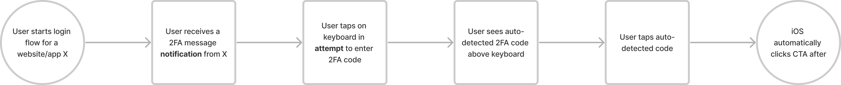
Previously, the journey may have looked like this (in fact it still does in instances the 2FA message is poorly constructed by the provider):

In the old journey, there is far more the user has to actually do. This includes remembering codes, leaving and re-entering the app/website, and typing in the actual code itself.
So to be able to wipe away all that *really hard* labour is powerful.
It’s a particularly powerful mechanism because of how seamless the experience is for the end user. It is a natural continuation of their existing journey. There are no additional steps, it’s intuitive, and it reduces one pesky task that has to be done.
We see this type of continuous UX in many places. iOS adds a layer of detection to make the continuous experience even more seamless, and so does Gmail:

Gmail does a great job here of presenting the immediate next action. Once anyone receives an email, they will be thinking of replying. So presenting quick replies is a natural continuation of the journey.

Teams will automatically detect if you are joining a call on a second device and ask you how you’d like to proceed. With this experience, you eliminate any echo issues that occur with two devices, and caters to switching or actually needing both devices. Optionality & error prevention in one.

Reddit has a similar approach to Gmail in its onboarding journey. While signing up, new users are given suggestions for fun usernames. Reddit doesn't have a real username vibe and therefore this fits well into their narrative and is the actual prompt on the screen that users are being requested for.
Think about how you could create continuous UX in your experiences. A simple mapping exercise for your user journey could unlock new opportunities to create continuous experiences and add a touch of seamlessness to your product.
AI Concept of the Week
Airtags but AI will tell you where it’s likely to be…

Imagine you can map out your house with AR using your iPhone, and based on that data, it can predict/tailor your experiences with devices accordingly.
Your HomePod in the kitchen will feel very different to a HomePod in the living room, so why shouldn’t you have a bespoke experience just for that!!
And if you keep spending lots of time on your WFH ‘resting couch’ that you bought during COVID, maybe your AirTag fell in there. AI would know…
Happy Thursday ☀️